Let’s dive right in. You dream of a cozy outdoor farmhouse. Imagine rustic chairs, string lights, and an old metal watering can as a flower pot.
But here’s the key question: What color combo captures that classic farmhouse vibe?
Let’s be real—some colors just don’t match the “rustic charm.” Some might scream “bad idea at 3 a.m.” We want to steer clear of that. 😬
If you’ve ever stood in the paint aisle, squinting at swatches, I understand. I’ve done it too, latte in hand and a pile of “maybe” color cards in the other.
Let’s sort through it together. We’ll find the best color combinations for your outdoor farmhouse—colors that feel thoughtful, not like a Pinterest board gone wrong.
The Vibe: What Are We Actually Going For Here?
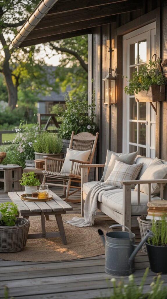
Before we splash any paint, let’s get our heads in the right place.
Outdoor farmhouse style is all about warmth, comfort, and a lived-in look. It should feel rustic but pulled-together. Relaxed, but not messy.
Think:
- Nature-inspired colors
- Muted, earthy tones
- Contrasts between old and new
- Cozy, weathered charm
The goal is to make your space feel like you could sip lemonade there all day—or wine at night—without wanting to change a thing.
Classic Color Combos That Never Fail
Here’s where the magic happens. These farmhouse-approved color combinations will help you build a space that feels cozy, curated, and straight-up gorgeous.
1. Cream + Sage Green + Weathered Wood
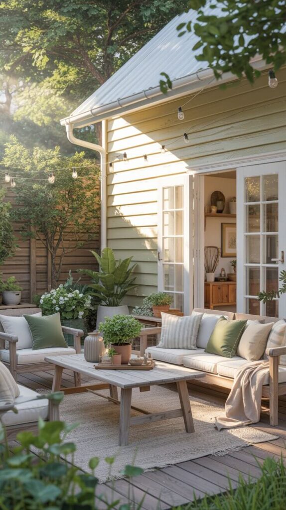
This one’s a total crowd-pleaser. Cream acts as your soft base, sage brings in the nature vibes, and wood?
Well, that just ties everything together like the rug in The Big Lebowski.
Why it works:
- Cream softens everything and works with natural light.
- Sage green feels earthy without being boring.
- Weathered wood tones add texture and rustic charm.
Where to use it:
- Cream-painted siding or trim
- Sage green throw pillows or potted plants
- Wood patio furniture or fencing
Ever sat on a sage cushion in the sun with a lemonade in hand? Chef’s kiss. Highly recommend.
2. Charcoal + White + Natural Wood Accents
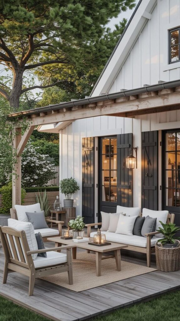
Ah yes, the cool farmhouse cousin.
Charcoal gives a bold, grounded feel without being harsh, and when you throw in crisp white and natural wood—boom—you’ve got yourself a vibe.
Why it works:
- Charcoal adds contrast and depth.
- White keeps it clean and light.
- Natural wood keeps it from feeling too modern.
Where to use it:
- Charcoal-painted shutters or outdoor trim
- White cushions or tableware
- Wood pergola, chairs, or decking
FYI: This is a great option if you want your outdoor farmhouse to feel a bit more modern without losing its soul.
3. Terracotta + Ivory + Olive Green
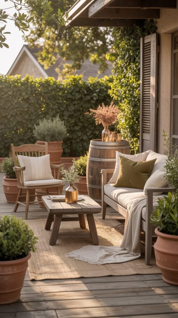
You want warm, inviting, and rustic with a twist? This combo’s your winner.
It leans a bit Tuscan but still totally fits the farmhouse look—especially if you add a few vintage pots or clay planters.
Why it works:
- Terracotta adds a pop of earthy warmth.
- Ivory softens and balances it.
- Olive green grounds everything in nature.
Where to use it:
- Terracotta planters or cushions
- Ivory-painted wood furniture
- Olive throw blankets or shrubbery
Pro tip: I once paired these colors on my porch with a vintage wine barrel table. Let’s just say I never wanted to leave.
4. Dusty Blue + White + Gray
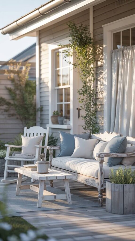
This one’s for those who want that airy, relaxed, coastal-meets-country look.
Dusty blue feels calm and serene, like the sky on a good day. Pair it with white and soft gray, and your outdoor space practically begs you to stay awhile.
Why it works:
- Dusty blue = calm + vintage vibes.
- White = clean and classic.
- Gray = neutral support character that never upstages.
Where to use it:
- Blue cushions or porch ceilings (yes, really!)
- White rocking chairs or siding
- Gray pavers, bricks, or planters
Rhetorical question time: Why does blue make everything feel fancier and more laid back at the same time? No idea. But it totally does.
5. Black + White + Copper or Rust
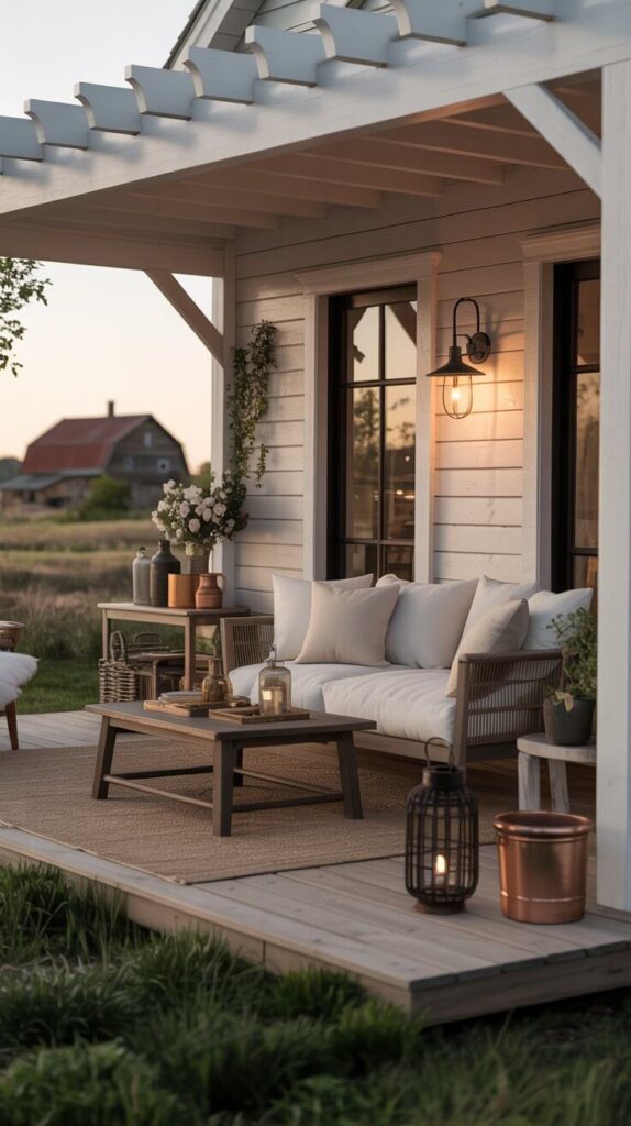
Feeling bold? You can go farmhouse without going full pastel.
This combo gives you a moody, grounded vibe that’s still farmhouse-approved—but with a little edge.
Why it works:
- Black creates contrast and sophistication.
- White keeps things crisp.
- Copper or rust accents add warmth and personality.
Where to use it:
- Black light fixtures or railings
- White cushions, siding, or pergola
- Copper planters, lanterns, or hose holders (seriously—rust never looked so good)
I know, I know—black outdoors sounds risky. But trust me, it pops in the best way.
Recommended Post:- Farmhouse Outdoor Décor Ideas
Tips for Choosing the Right Color Combo (Without Losing Your Mind)
Because let’s be honest—color overwhelm is real. Here’s how to make the process easier.
1. Look at Your Surroundings
Got a red barn nearby? Or a lot of green trees? Let nature help you decide. You want your color palette to complement what’s already there, not fight with it.
2. Stick to 3–4 Colors, Max
IMO, the sweet spot is:
- 1 main/base color
- 1-2 accents
- 1 texture or material tone (like wood or metal)
Too many colors = chaos. Keep it simple, and your space will feel intentional—not like a crayon box exploded.
3. Test Everything in Natural Light
Seriously, paint looks wildly different in sunlight. Always swatch your choices outdoors before committing.
4. Start with the Big Stuff
Pick your main elements first—siding, flooring, main furniture. Build your accent colors around them. It’s way easier than doing it the other way around (trust me, I learned that the hard way 😅).
Farmhouse-Friendly Neutrals That Won’t Bore You
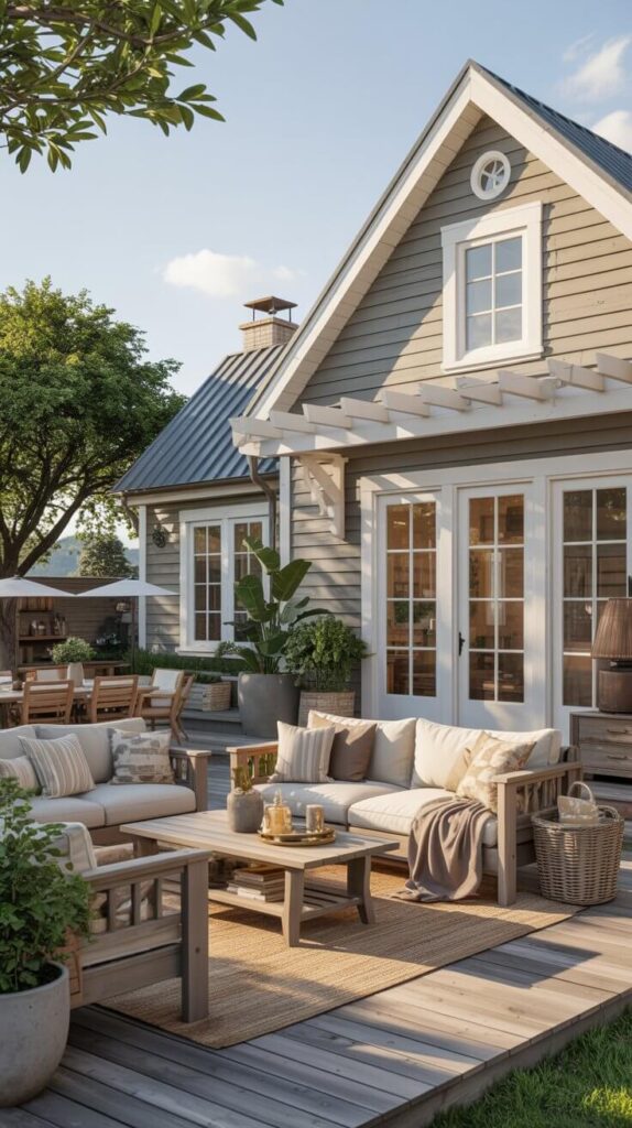
Not all neutrals are created equal. These neutral shades bring farmhouse charm without making your space feel bland.
- Greige (gray-beige): The MVP of modern farmhouse
- Creamy white: Warmer and more inviting than stark white
- Taupe: Feels earthy and grounding
- Stone gray: Neutral, but still has character
Use them for large surfaces—walls, decks, furniture bases—and build your accent colors around them.
Pop Colors That Still Feel Farmhouse-Approved
Want to jazz things up without going rogue? These colors give you a bit of “pop” without ditching the farmhouse vibe.
- Mustard yellow: Try it in planters or pillows
- Dusty rose: Sounds risky, but it’s oddly charming when done right
- Navy: A bold, timeless accent
- Forest green: Especially pretty with natural wood
Word of warning: Use these sparingly. A little goes a long way.
Final Thoughts: Let Color Tell Your Farmhouse Story
So, what color combination is best for an outdoor farmhouse? The short answer: It depends on the mood you want to create. But the long answer (which you now totally have) is that the best combos are:
- Warm, earthy, and nature-inspired
- Balanced with texture like wood and metal
- Personal to your space and your style
Recap time!
- Sage, charcoal, cream, olive, and dusty blue are all safe bets.
- Pair neutrals with 1–2 accents for balance.
- Test everything in outdoor lighting—swatches lie.
- Stick to 3–4 colors total. No more, no less.
- Add a personal touch with vintage finds or DIY flair.
And remember—there’s no one “right” combo. Just pick what makes you smile every time you walk outside. If your outdoor farmhouse makes you feel cozy, relaxed, and maybe a little bit smug (in the best way), you nailed it. 😉
Now go grab that paintbrush, friend—your perfect porch palette is waiting. 🎨
Recommended Posts:-