Alright, friend, let’s talk about one of life’s great mysteries:
How do you pick a color scheme for a transitional bedroom without it looking like a Pinterest board threw up on your walls?
I’ve been there—staring at paint swatches at 9 p.m., questioning every life choice that led me to believe “seafoam green” was a good idea.
Spoiler: It wasn’t. But after trial, error, and a few gallons of primer, I’ve cracked the code.
Let’s dive into the magic of blending traditional coziness with modern sleekness—without the regret.
1. What Even Is Transitional Design? (And Why Should You Care?)
Imagine if your grandma’s antique armchair and your Instagram-worthy minimalist lamp had a baby. That’s transitional design.
It’s all about balancing classic elegance with contemporary flair, creating a space that feels timeless but not stuffy. The secret sauce? Color.
Get it right, and your room whispers, “I’m sophisticated but chill.” Get it wrong, and… well, let’s not go there.
The Golden Rule: Neutrals Are Your BFF
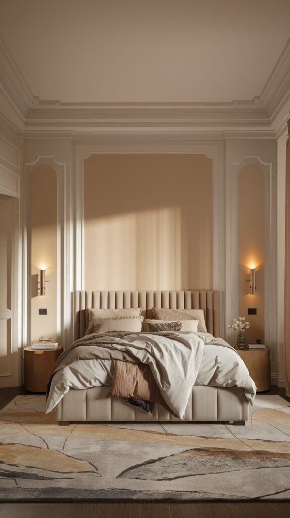
Transitional design thrives on neutral bases. Think warm whites, soft grays, and creamy beiges.
These shades act like a blank canvas, letting you layer textures and accents without chaos. But not all neutrals are created equal:
- Warm Whites (e.g., Swiss Coffee by Benjamin Moore): Cozy but crisp, like your favorite latte.
- Greige (Gray + Beige): The ultimate compromiser. It’s neither cold nor boring—just chef’s kiss.
- Taupe: Adds depth without drama. Perfect if you’re scared of commitment (no judgment here).
Pro tip: Test your neutrals in different lighting. That “perfect warm white” might look hospital-grade under LED bulbs. Ask me how I know.
2. Accent Colors: How to Add Personality Without Chaos
Okay, so you’ve nailed the neutrals. Now, let’s talk accents.
This is where you can flex your style—but don’t go full Rainbow Brite. Stick to 2–3 accent colors max, and keep them muted.
Sophisticated Pops of Color
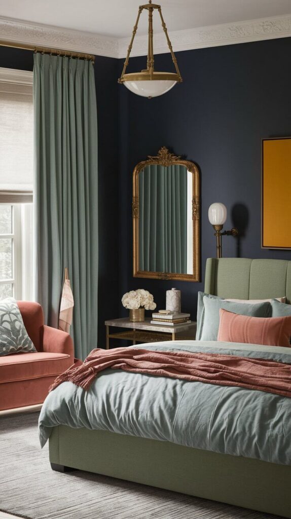
- Navy Blue: Classic, rich, and pairs beautifully with metallics like brass or gold.
- Sage Green: Nature’s chill pill. It’s calming but still interesting.
- Dusty Rose: Blush’s cooler older sister. Less “teen dream,” more “elegant retreat.”
Ever tried mustard yellow? I did—once. It’s like adding a shot of espresso to your room: bold, energizing, and slightly dangerous. Use sparingly.
Metallics: The Transitional MVP
Gold, brass, or matte black finishes add modern edge to traditional bones. Swap out dated chrome fixtures for a brass lamp or black cabinet handles.
FYI, a little metallic goes a long way—no one wants their bedroom to double as a disco ball.
3. Warm vs. Cool Tones: How to Strike the Perfect Balance
Transitional design walks a tightrope between warm (cozy) and cool (sleek). Too warm, and it’s grandma’s cottage. Too cool, and it’s a dentist’s office.
Here’s the cheat code:
Warm It Up With…
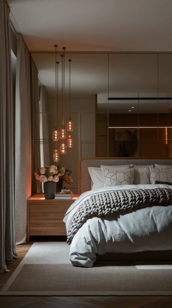
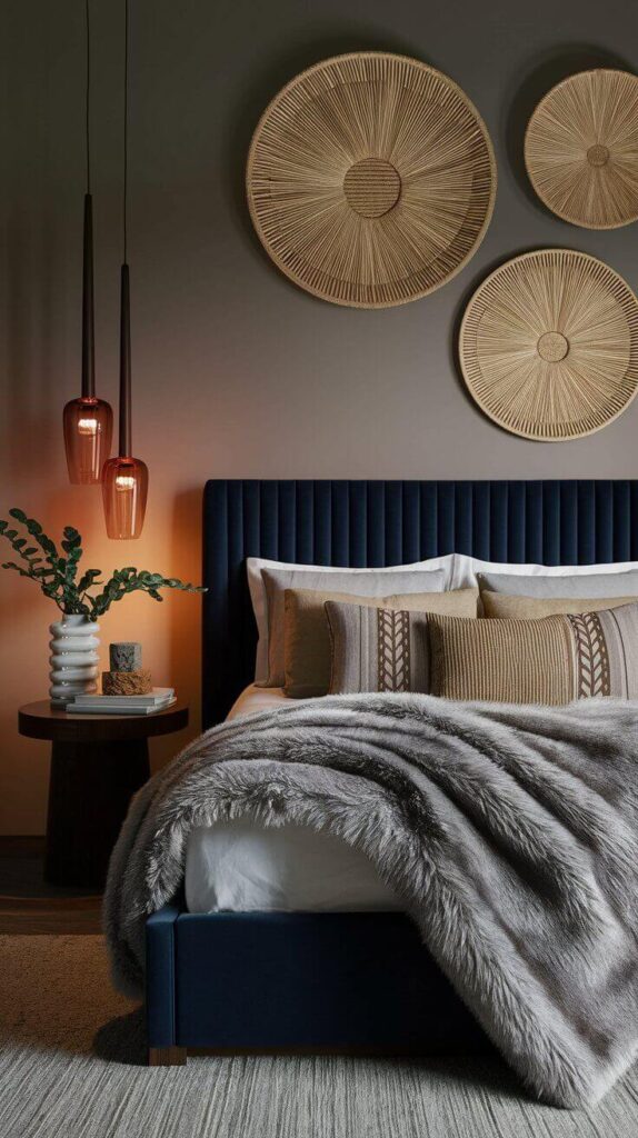
- Wood Tones: Mid-tone oak or walnut furniture adds organic warmth.
- Textured Fabrics: Think linen curtains or a chunky knit throw.
- Lighting: Soft, amber-toned bulbs beat harsh LEDs every time.
Cool It Down With…
- Crisp Linens: White or gray bedding keeps things fresh.
- Geometric Patterns: A subtle hexagon pillow or striped rug adds modern structure.
- Mirrors and Glass: Reflect light and space, making rooms feel airier.
Mix these elements like a cocktail—60% warm, 40% cool—and you’ve got balance.
Textures: The Unsung Hero of Transitional Spaces
Color is nothing without texture.
Seriously, would you eat a cake without frosting? (Don’t answer that.) Layering textures adds depth and keeps neutrals from feeling flat.
Here’s your shopping list:
- Velvet: A navy velvet pillow or headboard screams luxury.
- Woven Baskets: For that “I just came back from a Bali retreat” vibe.
- Faux Fur: A throw blanket that says, “Netflix and chill? Obviously.”
Avoid matchy-matchy finishes. Pair glossy side tables with matte frames, or smooth walls with a nubby rug. Contrast = interest.
Final Thoughts: Keep It Simple, Silly
Transitional design isn’t about rules—it’s about harmony.
Start with a neutral base, add muted accents, balance warm and cool tones, and layer textures like your sanity depends on it (because it kinda does).
And hey, if you mess up? Paint is cheap(ish), and decor is replaceable. Except for that mustard yellow phase. Let’s never speak of that again.
Your Homework: Grab three paint swatches, a throw pillow, and a glass of wine. Experiment. Trust your gut. And when in doubt, remember: beige doesn’t have to be boring.
Now go forth and create a bedroom that’s both timeless and totally you. 🛋️✨
Recommended Post:-
15 Transitional Bedroom Ideas for Beginners